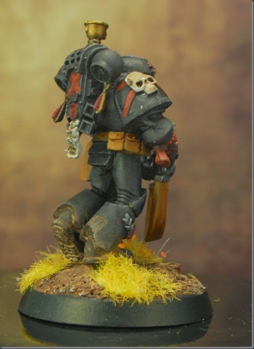
It’s been a while since I panted black, and with a shiny new squad of Death Company to do, I wanted to do a test mini first.
In order to do this, I dug out an old old death company metal mini that he previously been stripped, and gave it some spare bitz from the leftovers of the new box – the Death Co box gives you enough arms to give the guys bolters or CC weapons, and enough packs to use JP’s or normal powerplants..
To be honest, it’s worked so well, that I’m going to dig out some more of the metal bodies and build a second squad for drop podding.
They are a smidge small when compared to the new boxes, but that’s mostly posing not proportion, as these were cast metal they aren't very splayed out to avoid undercuts and things that could get caught in the mold. the newer models are all practically doing start jumps in comparison.
Anyhoo, feedback always welcome.


THe black looks good. It's not too flat, and the dust adds interest as well.
ReplyDeleteSome critques:
Vary the flock a bit. I like the leaves within the yellow, but using different colored flocks can add a lot of interest and variance in the base (instead of just using the yellow style grass).
On his head, the red skull needs some additional highlights. Because it's on his head, we naturally look there, so spending a bit of extra time there will always pay dividends. (it just looks a bit flat in the photo).
Those are just nit picks!
Hi greg thanks for the input- totally agree on the red skull xbones,
Delete- on the matter of the flock - it's actually much more contrasty irl, theres a much more visible green in there.. and across the unit there are some tufts of a much darker green too for variety. not sure why that's so washed out in the pic.
Arn't you supposed to be back at work ?
ReplyDeleteHe looks great, Your cheese company is gonna be jus' fine.
I am back at work ;)
DeleteI like the dark grey as opposed to pure black. Maybe dark shade the recesses with a navy/ black mix to make everything pop?
ReplyDeleteHi Zab, - I did think of that, but I wanted to avoid blues as it can overwhelm the model - it's actually a bit more contrasty irl - I'm using the Andrea miniatures black set and its highlight grey is quite light but it doesn't photograph very well - I think my setup is too diffuse (which is normally good for mini pics) I'll take the next few a step darker and re-white balance the camera for them
DeleteYeah it's weird cause your red looks really nice. The photo is a bit washed i guess. Still a nice PJ though :)
DeleteTotally - he's a wee bit smaller than the new plastics; but that's mainly due to the more compact pose that metals used to dictate
ReplyDelete