First, an apology. It’s been a while since I posted the trukk, but the reason is not much has happened hobby wise.
Work became insane, with end of year marking going ballistic and preparations for the exhibition.
Summer arrived, meaning lots of work in the garden, and much sitting in the sun reading (Ravenor omnibus, worthy of words, but not till I’m done)
Also, Red Dead Redemption arrived. and I’m a big western fan.
I do have a few offerings however from the hobby frontline, and I also seek opinions.
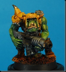
I painted another Ork.


Yeah, only one, but I tried to capture it on film. I am having some issues with my webcam and interference form my desk lamp, so I need to fix that.
anyway I’ll try and get that footage sorted soon.
now, I seek opinions and the title of the post becomes clearer.
If you’ve been reading my blog a while you might remember this guy-


At the time I painted him I really wasn’t happy, with either the scheme or the terrible job I did on it. I even had trouble photographing him, cursed mini. so I left the guard alone a while as I was at a bit of a loss, but recently I dug out a few minis and tried a few test schemes, only two, but I was looking for some feedback from you for a direction.
the first of the new blood,


A desert/wasteland feel, on red earth similar to the Orks I’ve been doing, maybe there's some terrain for those in my future.
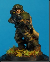
the second of the new blood,


A more woodland feel, something like the Action men I had as a child :)
So there you have the two new guys.
I’m looking for some help here, which direction do you prefer? please don't judge on the basis of the paint jobs, these are very quick rough jobs, the Urban/Winter look of the top guy is still in the running even, it’s more about colours, patterns etc, and I’d also love to hear any refinements, you know, “grey guy, but with darker armour” etc. I’ll try a couple out, and by the end of this have both a scheme and a rogues gallery of differently coloured IG I don't know what to do with :)
Anyway I hope that update amused you for a few minutes, and I promise I’ll try to do better :)

I quite like the desert look, although you would need to redress the base which is awesome by the way and fits better with the woodland look. Might be as simple as keeping all the materials the same but changing out the dark brown for a lighter tan colour.
ReplyDeleteI've got to say that I'm liking the desert uniform a whole lot. It has personality and depth that are offset very well by the base - as Rogue Pom said.
ReplyDeleteI have to vote for the desert camo also. It's the only warm color mix, which typically do better at catching the eye for scoring.
ReplyDeleteI would look to add some counter point elements to the tan and yellow. Something in a medium blue tone would really help and give a simple pairing. A rich red would give an angled pairing. It might be a matter of trying both and seeing what you like. Sight lens and maybe squad/unit markings, rifle stock, or something else? Possibly even an entire shoulder pad or facial "tattoos"?
Cheers and hope that helps.
Hi guys, thanks for taking the time to comment.
ReplyDeleteso far a resounding hit for the desert camo.
I'm going to try 1 or 2 more desert schemes/variations. I do agree with Dverning that there not enough contrast on the mini, the trick is, in my mind, balancing the idea of camoflage, with a mini I want to be eye-catching, the two are almost totally mutually exclusive.
I have a few ideas though.
Rogue you are absolutely right about the base, I've ordered some much yellower grasses and flock. as to the colour, I went with that becuase of the Orks I'm painting with the thought of a board in the future, but I think it's better to0 tailor the base to compliment the mini best and something lighter would do that. I'm thinking about sand, with some striking reddish rocks thrown in and maybe some sparse grasses etc.
sadly the next few minis tested on wont be the same pose. ah well, it couldnt last. I built these guys originally as a veteran unit, so the next few have det charges and meltas :)
I'm not so sure about mixing up the camo and armour so much. I think what you have achieved there is really cool. Where you might bring in another colour is on the weapon. Definately hit the sight with some red or blue and try a complimentary edge highlight across the front third of the barrel. Add in a decal on the shoulder (maybe wash the decal to tone down the brightness of the white). Taken with a lighter base (I would keep the same foliage mix but some red rocks would look cool) and this should be enough to bring a bit more pop to the mini. Also remember that you need to get a couple together to see how they look in a group - what works for a single mini doesn't always work at the squad or army level.
ReplyDeleteThey're all so beautiful *sniff!*
ReplyDeleteHigh praise indeed for such a coinessuer of the guard :)
ReplyDeleteThanks Drax
seeing your whole painted army the other day has inspired me yo get a bit of a wriggle on too. I pretty much painted a squad today, though itll be a couple ore before I can photograph and post them.