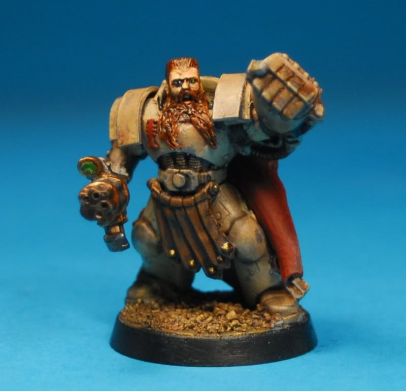
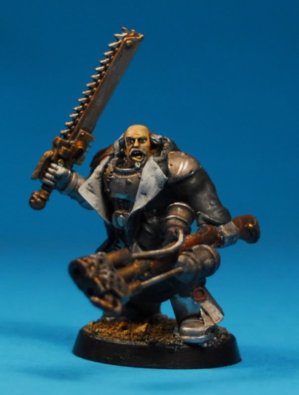
Originally he was going to be a variation of gold / bronze.
here he is in grey as a reminder.

Now, still thinking about gold I decided to use some of the acolytes as "test -beds" for the type of gold.
This guy got washed to within an inch of his life

This fellow got some bastard form of NMM (first time I've ever done it on such a large area)
And this fellow got the bronze end of the spectrum
If I'm honest I like them all, and that's part of the problem.
I'm also very pleased with the way this guy turned out
I'm also very pleased with the way this guy turned out
 raising yet more questions.
I like my other =][= too, and silver might make him "pop" against all the red and gold.
 and lastly, sticking with the cold colours scheme I like greay, with read and NMM gold accents, similar to this chappy I did a while back
So bearing the above in mind, I'm asking you, fellow bloggers and hobbyists, how should I paint my Lord?
I'm going to wait a while to start anyting, I made some objective markers today, I've two more Daemonhosts to build; two chimeras and two more acolytes to paint and a whole IG force to deal with before I "run ouot" of stuff to do and have to start on him.


Hmm, not going to lie to you: I'm not a fan of all metallic paint schemes. It's very hard to do well, not to say that you don't have the skills to do it. I would use bronze or gold as an accent color to red, purple, or black. I know the colors are a bit cliche for an Inquisitor, but I think they're cliche because they work so well!
ReplyDeleteI'm not much cop with colour, I'm afraid, but I like the first painted chap (with the sword) the best if it's any help at all...?
ReplyDeleteI agree i like the first guy but looking at him the coat seems to tone down all the gold and you wont have that on your lord. so i would probably say go for the last guys gray scheme but use the dirty gold colour of the first guy insted of the bright gold that he has.
ReplyDeleteI agree with Admiral Drax. The ink-washed gold looks best & gives it the Blanche gritty factor in my opinion. The lower halves of the shoulder pads & the hammer can be painted silver to get you the 'pop' factor.
ReplyDeleteWashed gold it is then, accent colours wills tick with the cram and red theme.
ReplyDeleteI might actually have to get on and do this this weekend.